1. Dashboard Overview
Last updated: June 11, 2026
Introducing the new Data Center in exacare
We are excited to officially introduce the new exacare Data Center!
What's new?
A cleaner, organized layout
Dashboards are grouped at the top by category, giving you quick access to referral, census, workflow, and exacare ai feature insights.
Detailed breakdowns by topic are now live in dedicated Deep Dives, so you can move from summary to specifics without searching across multiple reports.
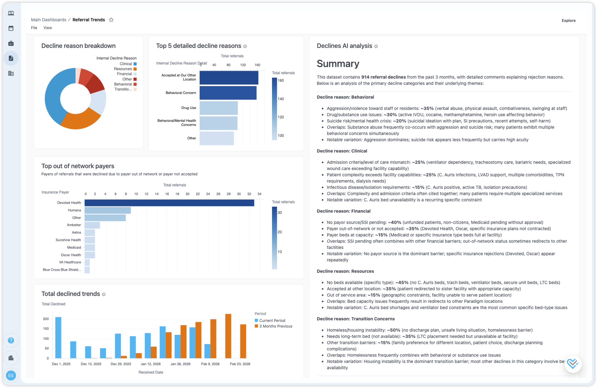
AI-powered insights
Smart AI summaries analyze data and comments to extract key themes.
AI assistant is now available across all dashboards for those with report builder permissions. If you do not have access, please request access from your administrator.
You can ask questions about an entire dashboard or follow up on a specific chart or table.
Learn more
To help you get the most out of the new Data Center, we are hosting live training sessions that will cover:
The new dashboard layout and where to find key reports
Using our AI assistant to explore insights and build custom reports
Creating and editing dashboards using AI
Sharing, exporting, and scheduling reports
Open Q&A
Register for live training here: Data Center training registration
Explore our feature spotlight and step by step guides to learn how to use the new dashboards, create custom reports, using AI for analysis and more.
FAQs
Where are the old dashboards?
We have retired the previous versions of our dashboards as part of the new launch.
The underlying data remains consistent, but the layout has been reorganized to make reports easier to find and navigate.
Here is how legacy dashboards map to the new structure:
Admission Trends Dashboard → Referral Trends
Daily Census Status Report → Census Status
Monthly Census and Referral Dashboard → Census Trends
Organization and Staff Efficiency → Response Time Analysis
Pending Referrals Report → Referrals Requiring Action
Referral Status Report → Referral Status
Source Trends → Source Deep Dive
If you are looking for a specific report and are unsure where it now lives, please reach out to our team or visit the Help Center
Will our scheduled report deliveries be impacted?
All existing scheduled report deliveries will continue without interruption.
We are migrating your deliveries to the equivalent dashboards in the new Data Center.
Because reports have been reorganized, you may notice changes in layout or included tiles. If you have any questions, please let us know.
Our organization does not have exacare bed board. How does this impact our reporting?
If your organization does not have exacare bed board, occupancy and discharge data within the Census dashboards will not apply to you. Admission data, including admits and readmits, will remain accurate and fully available.
Dashboards include notes to clearly indicate which tiles are not applicable for organizations without bed board.
Description:
Exacare ai dashboards provide a centralized, interactive view of your operational and clinical data. This article walks you through how to navigate dashboards, understand our new layout, refine results using filters, explore details through drill-downs, and use exacare ai to ask questions about the data you’re viewing.
Exacare ai Dashboards
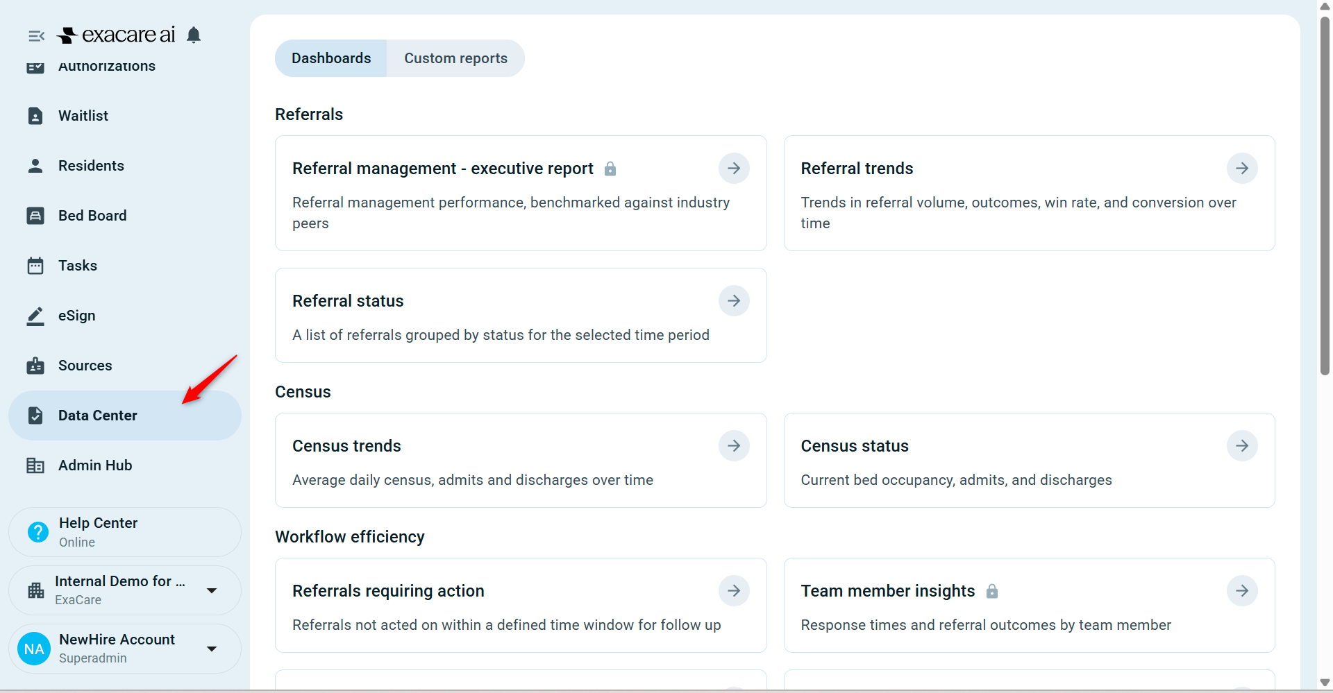
Referral Status Dashboard
Overview:
The Referral Status dashboard provides a high-level snapshot of referral activity across your facilities. It is designed to help you quickly understand where referrals are in the admission process and identify areas that may require follow-up or action.
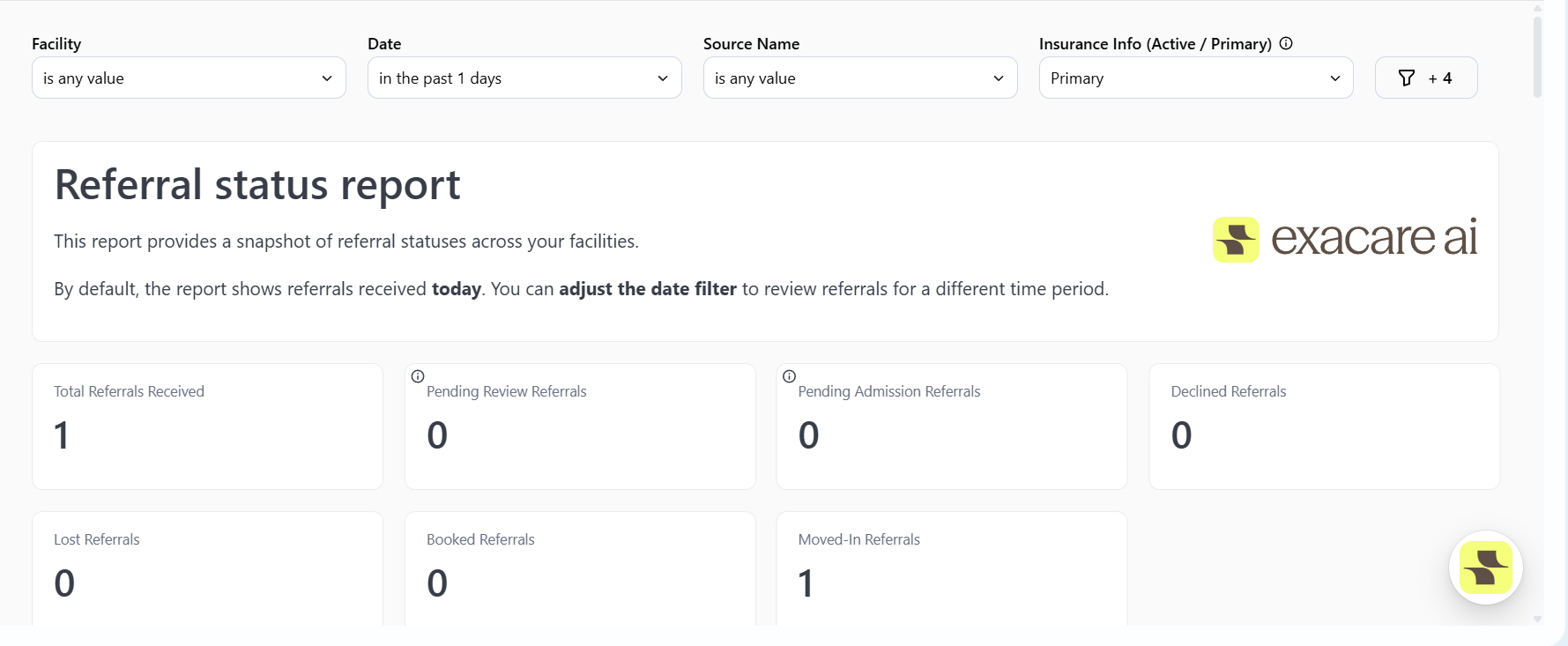
What this dashboard shows:
The Referral Status dashboard includes key metrics that summarize the current state of referrals, including:
Total referrals received
Referrals pending review (new referrals that have been received)
Referrals pending admission (accepted referrals)
Declined referrals
Lost referrals
These metrics give a clear view of referral volume and progression through the intake workflow.
Types of reports included:
Summary tiles that display referral counts
Tables that list the individual referrals that contribute to each metric, allowing you to review referral-level details and understand what is driving the numbers
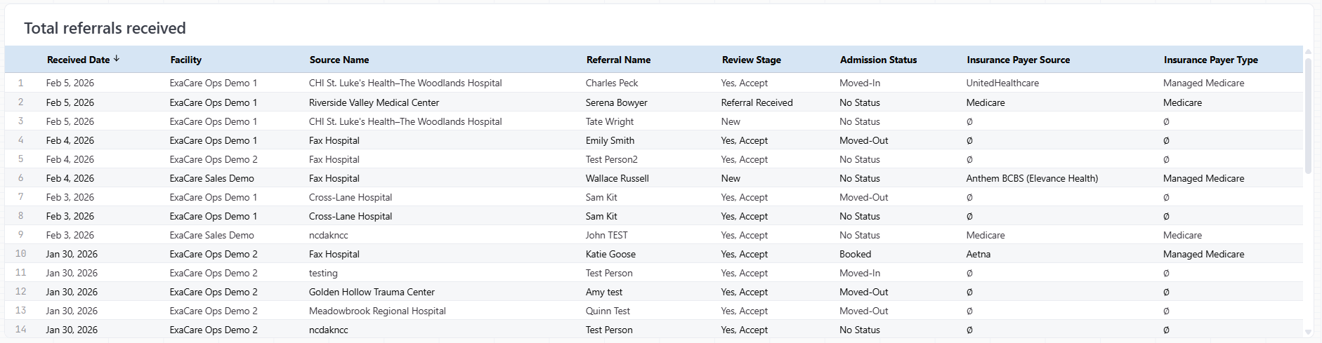
Tip: The tables update dynamically based on applied filters.
How this dashboard is commonly used:
Customers typically use the Referral Status dashboard to:
Monitor referral admission activity across facilities
Identify referrals awaiting review or admission
Understand trends in declined or lost referrals
Referral Trends Dashboard
Overview
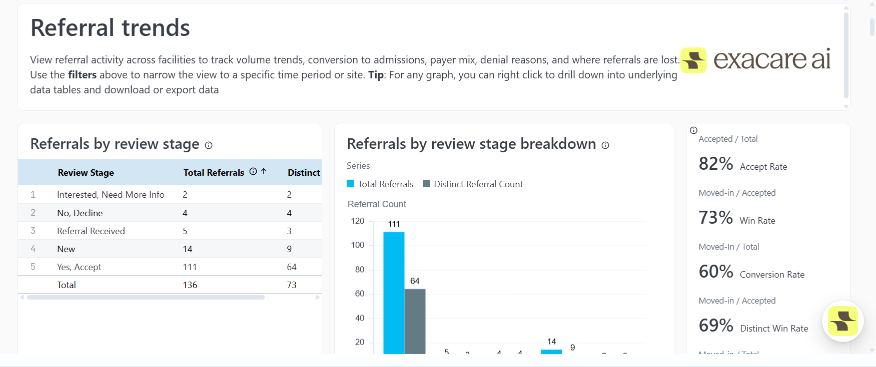
The Referral Trends dashboard helps you understand how referral activity and outcomes change over time across your facilities. It is designed to highlight patterns in referral volume, conversion to admissions, payer mix, and where referrals are being declined or lost.
What you’ll find in this dashboard
This dashboard includes a set of trend-focused reports designed to show how referral performance evolves over time, including:
Referral volume trends across facilities
Referrals by review stage, such as accepted, declined, or needing more information
Win rates (moved-in referrals compared to accepted referrals) and conversion rates (moved-in referrals compared to total referrals)
Historical total referral trends and month-over-month changes
Referral trends by insurance payer type, showing payer mix and performance
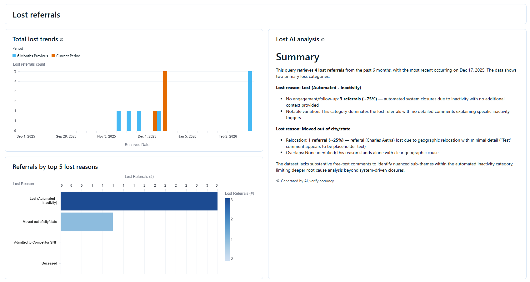
Top declined reasons
Top lost reasons
How this dashboard is commonly used
Monitor referral growth and performance over time
Understand how payer mix impacts conversion and outcomes
Identify recurring decline or loss reasons
Track improvements or changes in win and conversion rates
Census Trends Dashboard
Overview:
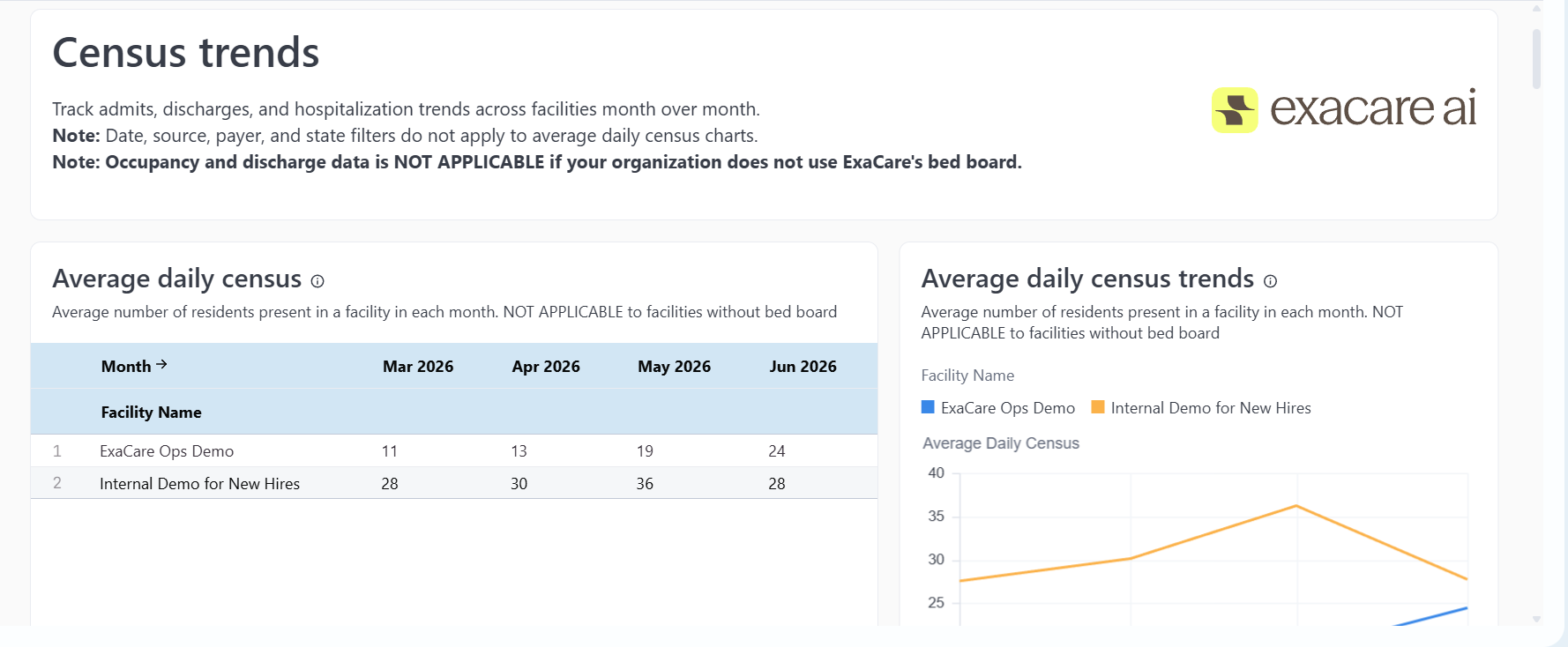
The Census Trends dashboard helps you understand how census changes over time across your facilities. It provides visibility into admissions, discharges, booked patients, and hospitalization trends, with a focus on month-over-month changes and overall census movement.
What you’ll find in this dashboard
This dashboard includes trend-based reports that show how census activity evolves over time, including:
Average daily census and historical average daily census trends
Month-over-month census trends across facilities
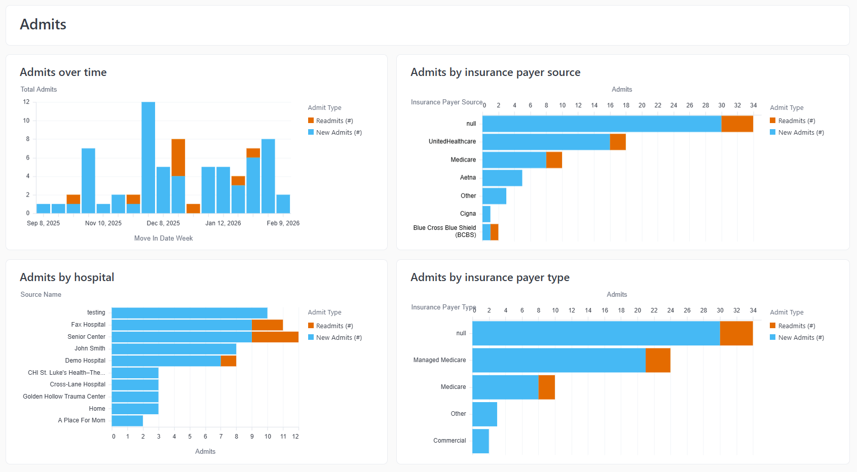
Admissions trends over time
Admissions broken down by insurance payer source and insurance payer type
Admissions by hospital
Discharge trends over time
Discharge reasons, including key findings using AI analysis
How this dashboard is commonly used
Monitor census change over time
Analyze admission patterns by payer and hospital
Identify discharge trends and common discharge reasons
Support census planning and operational decision-making
Census Status
Overview
The Census Status dashboard provides a daily snapshot of facility census and occupancy. It is designed to give you a real-time view of current residents, bed utilization, and daily census activity across your facilities.
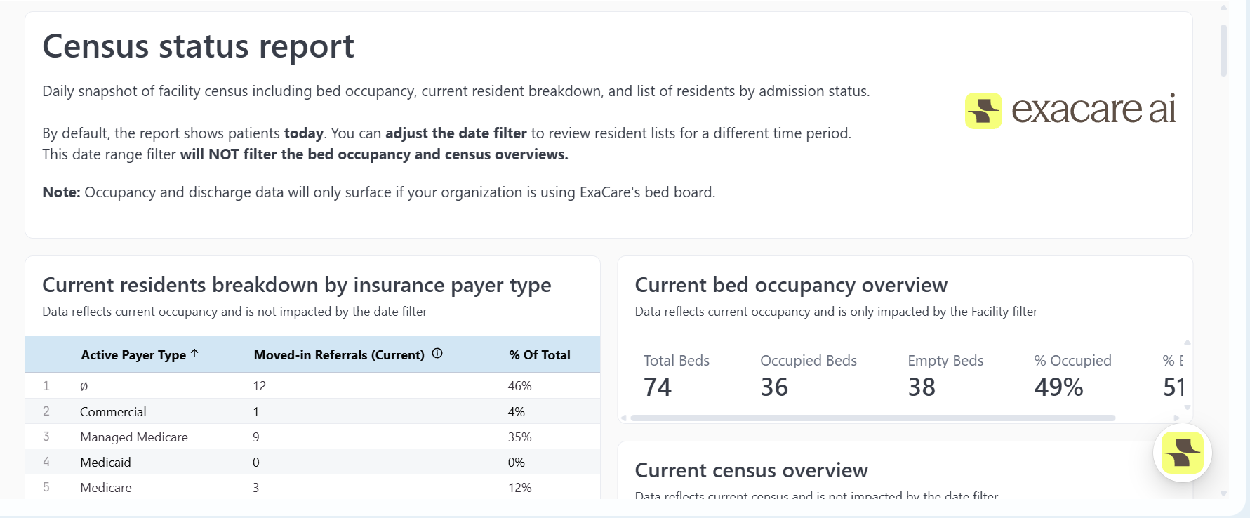
What you'll find in this dashboard
This dashboard includes real-time reports focused on current census status, including:
A breakdown of current residents by insurance payer type
A bed occupancy overview, showing total beds, occupied beds, available beds, and occupancy percentages
Daily census activity metrics, such as new admissions, readmissions, hospitalizations, discharges, booked patients, target admissions, and scheduled discharges
Referral specific tables for all census related actions
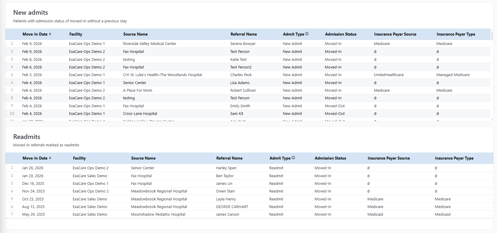
How this dashboard is commonly used
Review current occupancy and available capacity
Monitor daily admission and discharge activity
Understand the current resident payer mix
Support daily census reviews and operational planning
Response Time Analytics Dashboard
Overview
The Response Time Analytics dashboard provides a comprehensive view of how quickly referrals are acted on and resolved across key decision stages. It highlights response times from referral received through first action and final decision, helping identify trends, delays, and opportunities to improve referral turnaround.

What you'll find in this dashboard
This dashboard includes time-based reports that measure referral responsiveness across the intake workflow, including:
Time to first status change, showing how quickly referrals receive an initial action after being received in exacare
Time to final decision, measuring the time from referral receipt to an accept or decline decision
Time to accept and time to decline, highlighting differences in decision timelines
Median response times across key decision stages
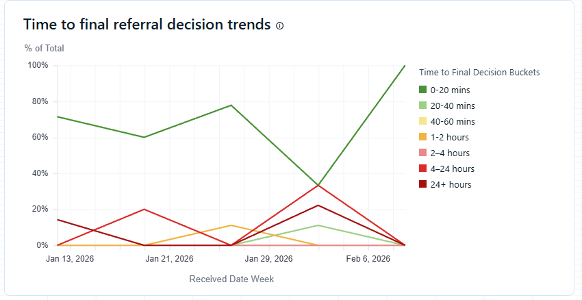
How this dashboard is commonly used
Monitor referral responsiveness and turnaround times
Identify bottlenecks or delays in the intake process
Compare response times across facilities or time periods
Note: The Response Time Analysis dashboard is available to Super Admin users only. If you do not see this dashboard and believe you should have access, please contact your exacare Super Admin!
AI Suggestion Dashboard
Overview
The AI Suggestion Alignment report provides visibility into how closely exacare’s ai Screener recommendations align with final referral decisions made by staff. It compares AI suggestions—Accept, Maybe, and Declined—with the actions ultimately taken, helping evaluate how effectively the AI supports referral decision-making.
What you'll find in this report
This report tracks how staff decisions align with AI recommendations across key suggestion categories, including:
AI Accept metrics, showing how often referrals are accepted or declined when the AI suggests Accept
AI Declined metrics, showing how often referrals are accepted or declined when the AI suggests Declined
AI Maybe metrics, showing how often referrals are accepted or declined when the AI suggests Maybe
Task Dashboard
Overview
The Task Dashboard provides an at-a-glance view of task activity across your team. It highlights task volume, completion status, timeliness, priorities, and individual performance, making it well suited for real-time, interactive use.
What You’ll Find in This Dashboard
This dashboard includes reports that summarize task activity and performance, including:
Task status breakdown, showing open, in-progress, and completed tasks
Task completion on-time breakdown, highlighting timeliness and overdue work
Priority level breakdown, showing task distribution by priority
An overall task list, providing visibility into individual tasks and ownership
2. Using Filters:
Filters allow you to customize dashboard data to focus on the timeframes, facilities, and referral details most relevant to you! Applying filters updates all applicable reports in real time, helping you quickly identify trends and answer specific questions without changing the underlying data.
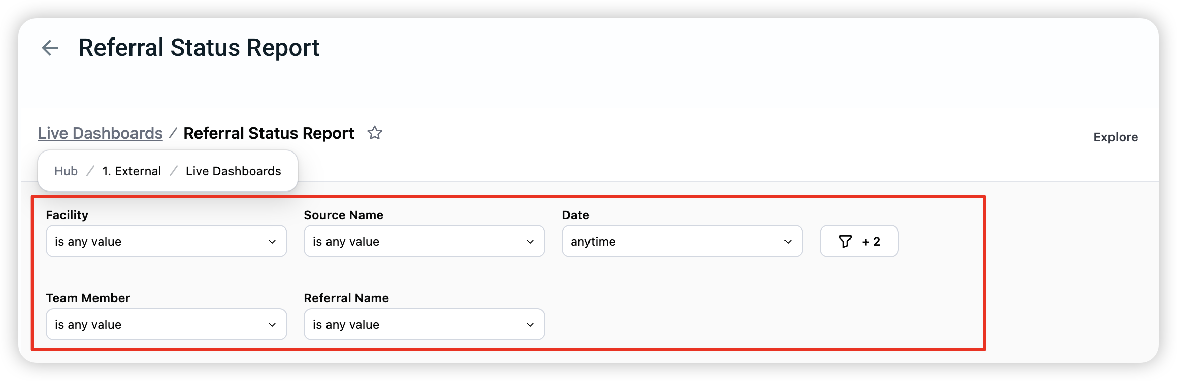
How to use filters?
Select the filter you want to use from the dashboard filter bar. A dropdown will appear for the filter you select.
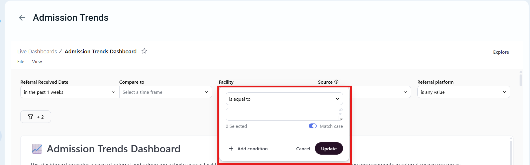
Choose one or more values (i.e. a date range or facility).
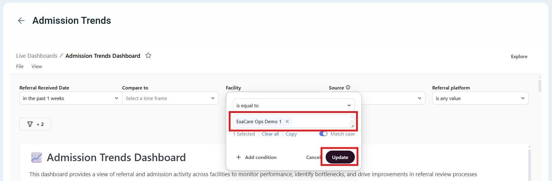
Click "Update" and the dashboard changes automatically to reflect your selections.
Common Filters:
Referral received date
Facility
Source
Referral platform
Referral Name
Weekday filter
Some filters, such as date filters, also support comparison views (for example, comparing one time period to another).
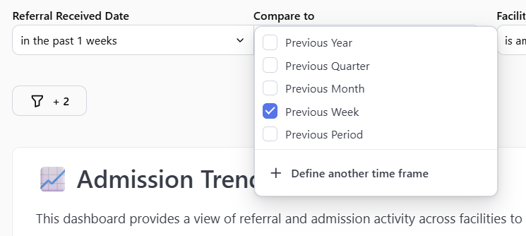
Filters can be layered to narrow results. For example, you might apply a date range and then refine the data further by facility or referral details.
3. Drill Down Feature
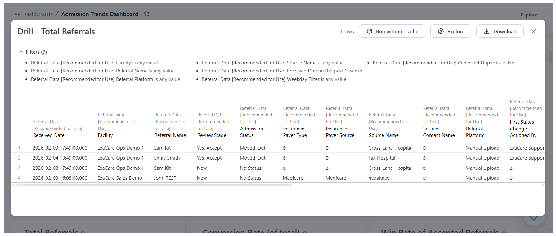
Drill-down allows you to explore the details behind a number or chart on a dashboard. By clicking into a data point, you can view the underlying records that make up the result, helping you better understand what’s driving the data you see.
How to Drill Down?
Right click on a data point or chart
Select "Drill"
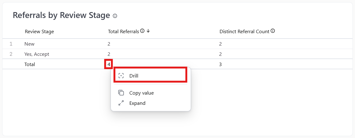
Done! You can now see the underlying data that contributes to that result.
4. AI Dashboard Assistant:
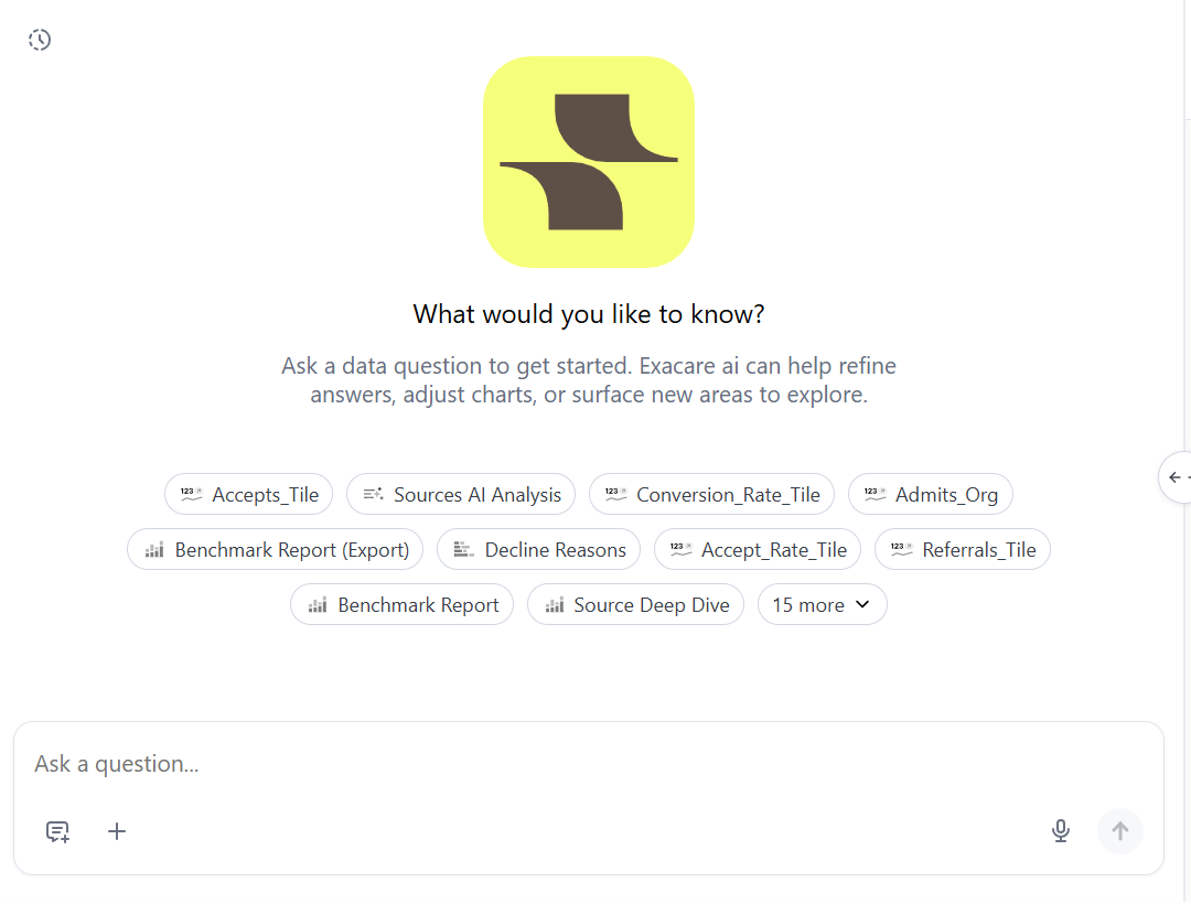
The AI Dashboard Assistant helps you better understand your data by answering questions about your dashboards, highlighting key findings, and explaining what those findings may mean. It provides helpful context around trends and results so you can interpret your data more confidently and efficiently.
How to locate this tool:
Navigate to any dashboard within the Data Center.
Select the exacare icon in the bottom-right corner of the screen.
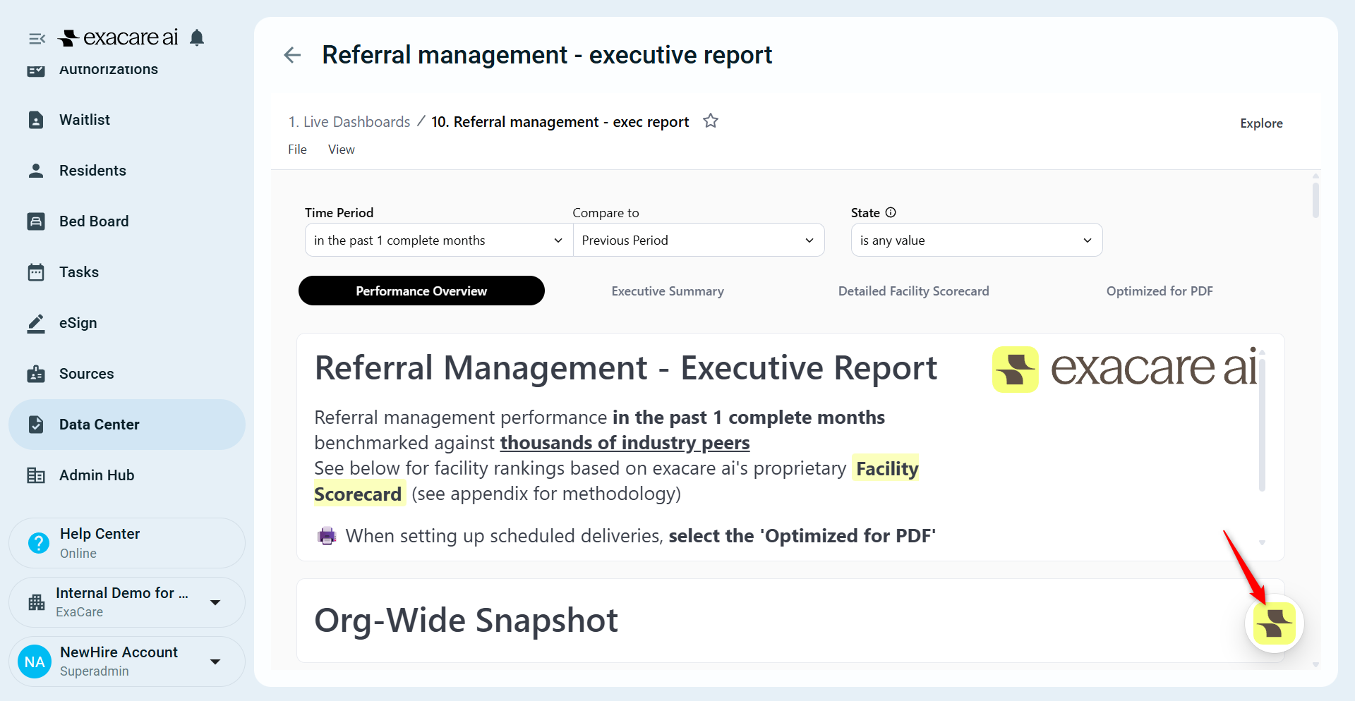
Done! The assistant opens in a chat-style window where you can begin asking questions immediately.
New Features:
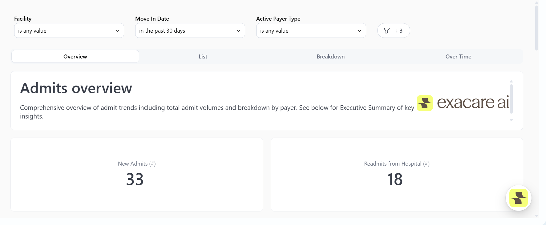
Deep Dives
Deep Dives provide a centralized way to explore all related data around a specific topic in one place. They allow users to quickly click into a focused view and access detailed information, trends, and supporting data without needing to search across multiple dashboards or reports.
Deep Dives are designed to make deeper analysis faster and more intuitive.

Types of Deep Dives
Accepts
Admits
Declines
Discharges
Lost referrals
Payer
Source
Each Deep Dive brings together all relevant data related to that topic, providing easy access to the metrics, trends, and details that support deeper understanding.
New Dashboard Changes:
Admission Trends Dashboard --> Referral trends
Daily Census Status Report --> Census status
Monthly Census and Referral Dashboard --> Census trends
Organization and Staff Efficiency --> Response time analysis
Pending Referrals Report --> Referrals requiring action
Referral Status Report --> Referral status
Source Trend